

Hi, I'm Nami Tajima


URBAN GARDEN
2022 Spring [ IG posts, poster, postcard ]
Typography 2
Type 2 further explored how to utilize type as visual communication along with grids and the systematic approach to visual communication
Research
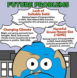
My goal with this project was to find out how to get people to pay attention to social issues. I chose urban gardens because I thought it would be easier to improve the problem than any other social issue. I believe that getting people to learn about urban gardens and to plant even small plants will make a big improvement.
Tools
procreate
illustrator
photoshop


Sketch
I started sketching graphics, thinking that people would pay more attention to creating graphics than to photographs. I add faces to show that plants and the earth also have life.
Color
Main Color
Background Color


#e4007f
#fff100


#0090e8
#2ba737

#c1c3dc


Digitalize
Combining images and typography in this project was challenging. Using a simple san serif typeface was the solution.
I used yellow so that the buildings wouldn't lose to the characters of the earth and trees. I made the title stand out by eliminating the background illustration of the title part called "Urban Garden" and make it plain. The Urban Garden is represented by placing plants on the window of the buildings. This "US" means human and anthropomorphic of plants


